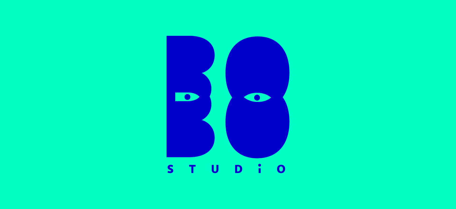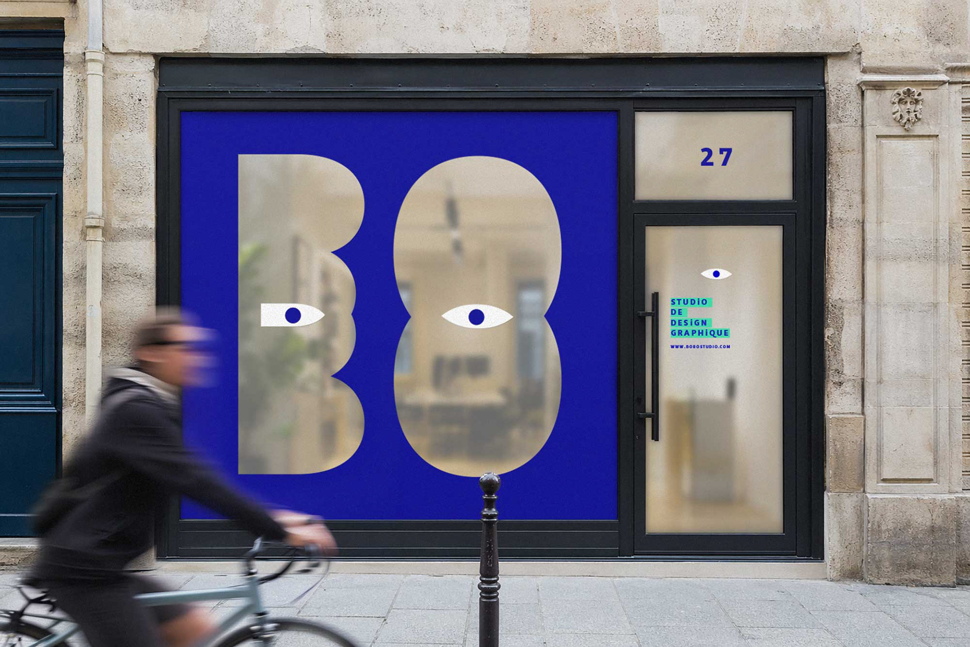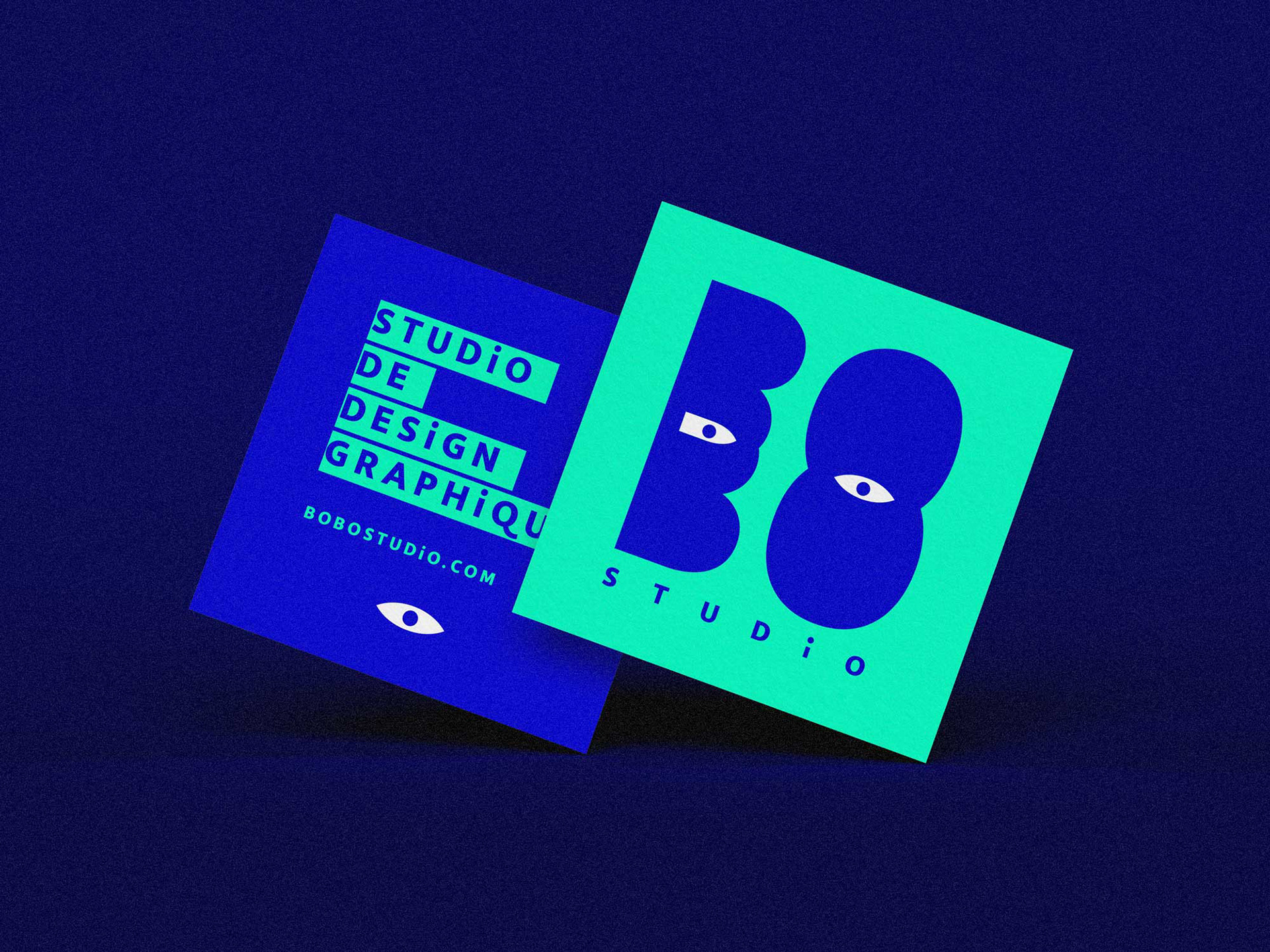
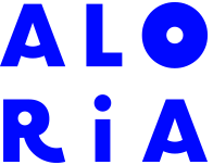
Bobo Studio is a graphic design studio founded by two brothers, Boris and Roberto (aka Bob). I designed their logo and full visual identity.
The logo is built around the idea of duality: two individuals, two personalities, two perspectives coming together in a shared creative momentum. The two “BO” letterforms, treated as solid blocks, reference childhood wooden building toys. When stacked, they evoke playfulness, balance, and the idea of “standing strong together” — becoming more inventive as a duo.
The intersection of the two “BO” shapes reveals negative spaces resembling eyes, adding a human touch and a hint of mischief. The result is a playful, fresh, and accessible identity that avoids rigidity or excessive formality.
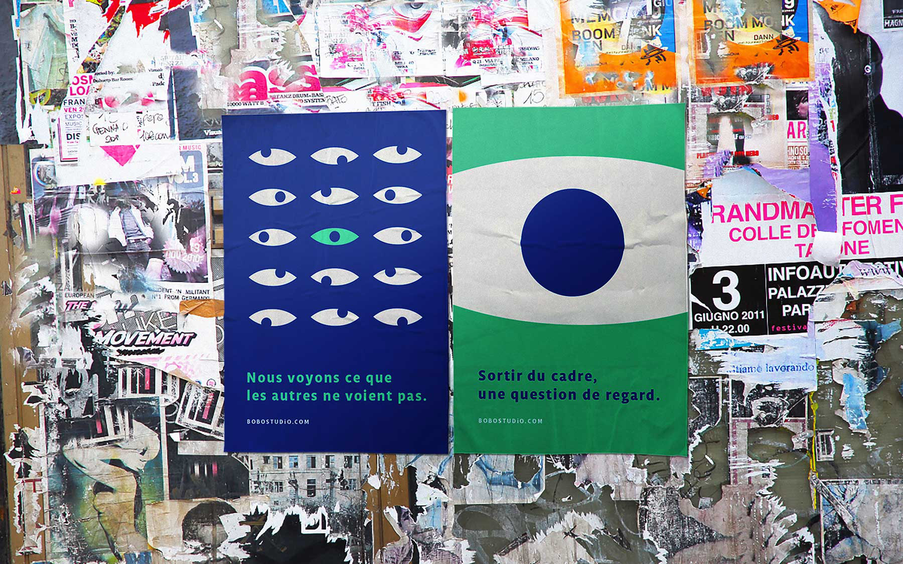
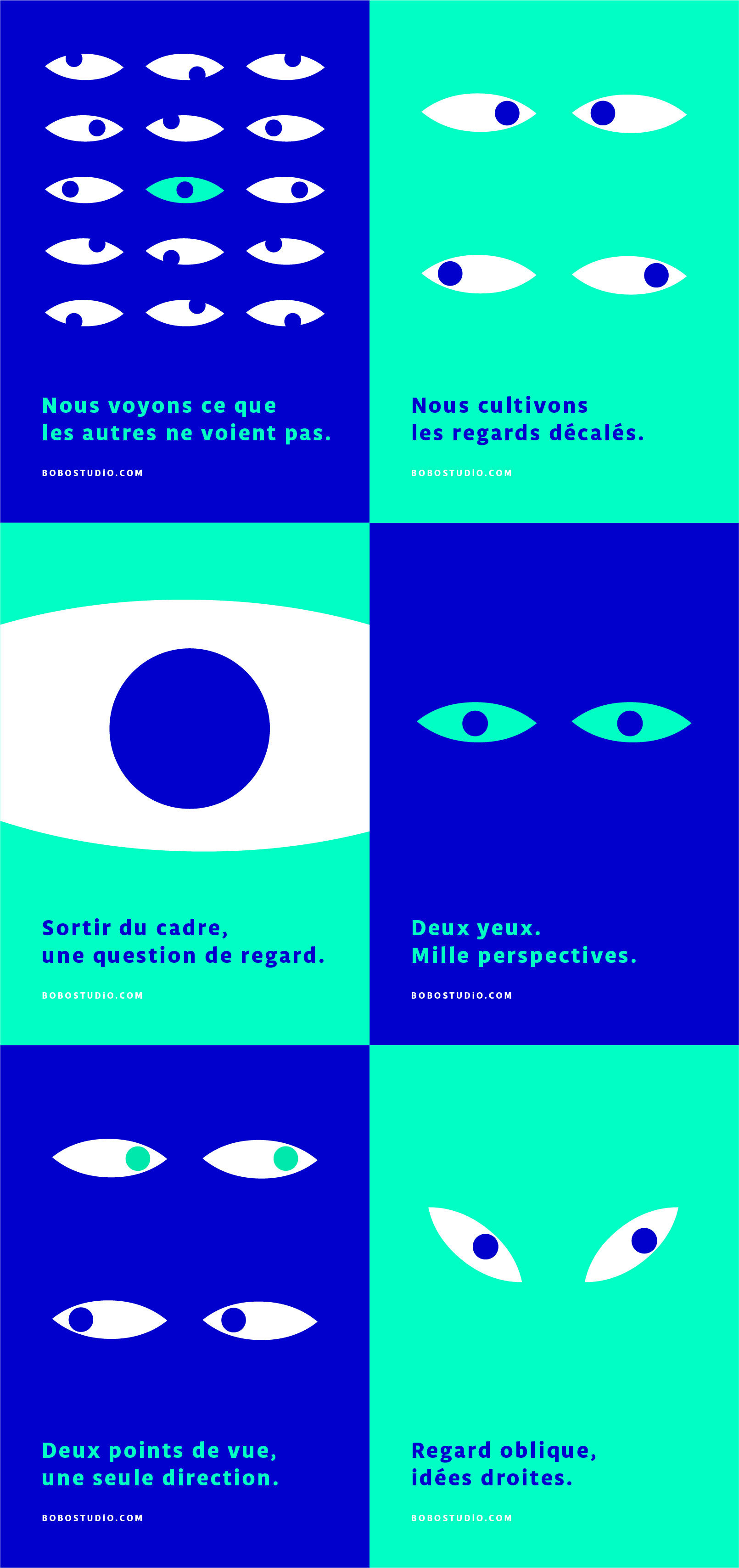
The graphic system expands on this concept by exploring the idea of “the gaze” as a visual thread. Echoing the eyes in the logo, it uses wordplay and minimal forms to create striking visuals — a simple, direct, and unembellished approach.