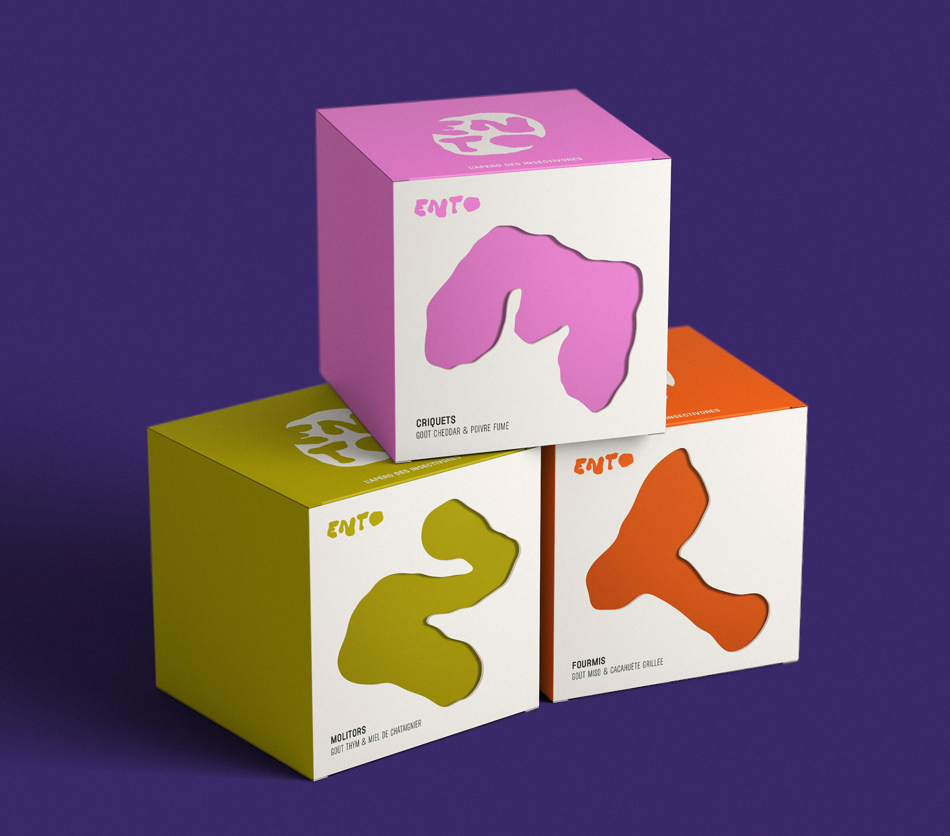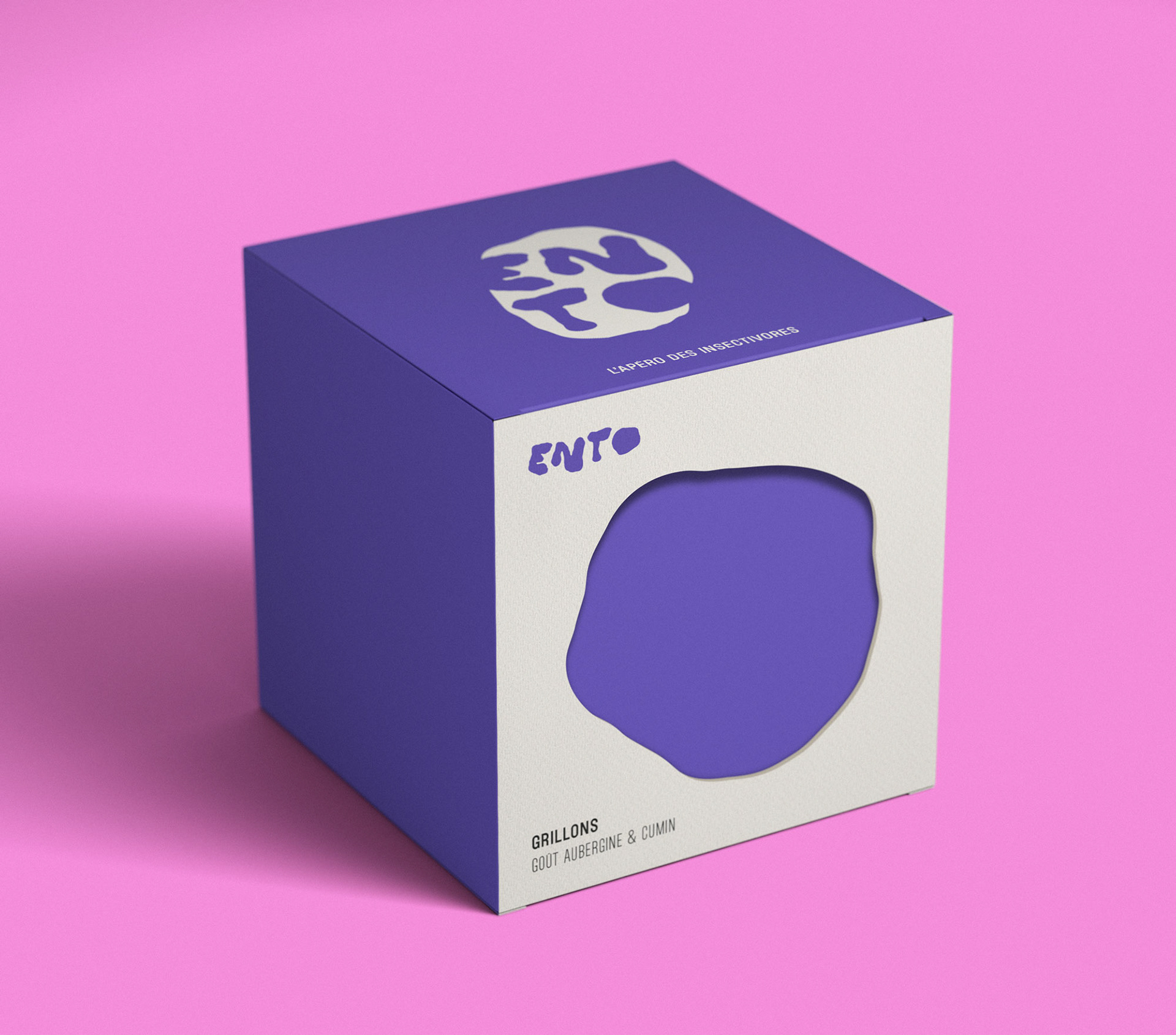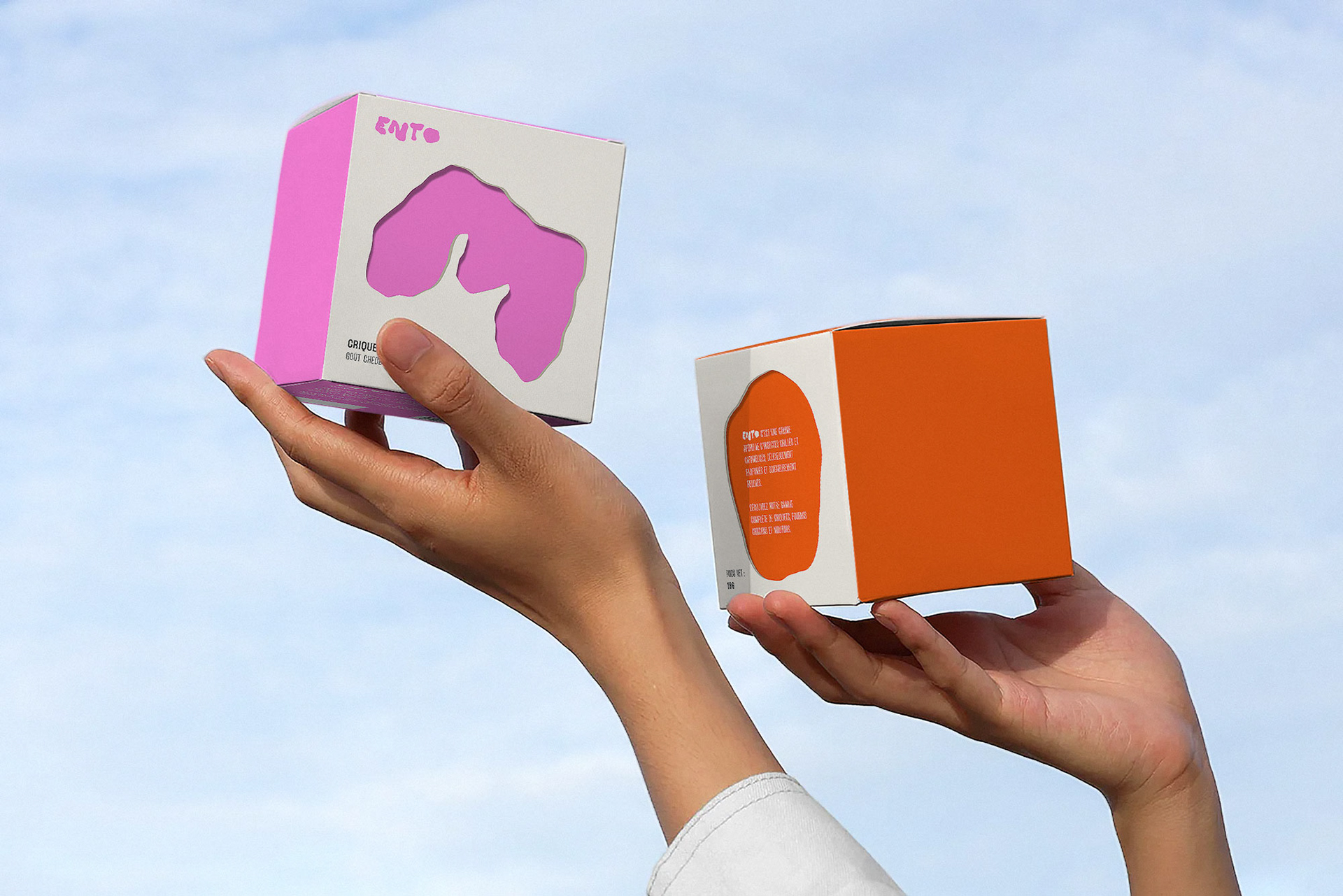
ENTO is a range of insect-based aperitif products available in four varieties: grasshoppers, crickets, mealworms, and ants.
I led the project’s overall art direction, from brand identity (logo and visual universe) to packaging design.
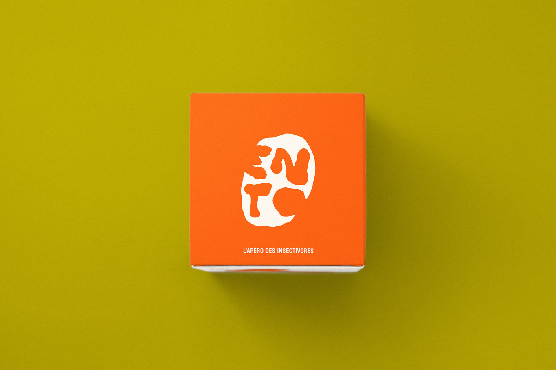
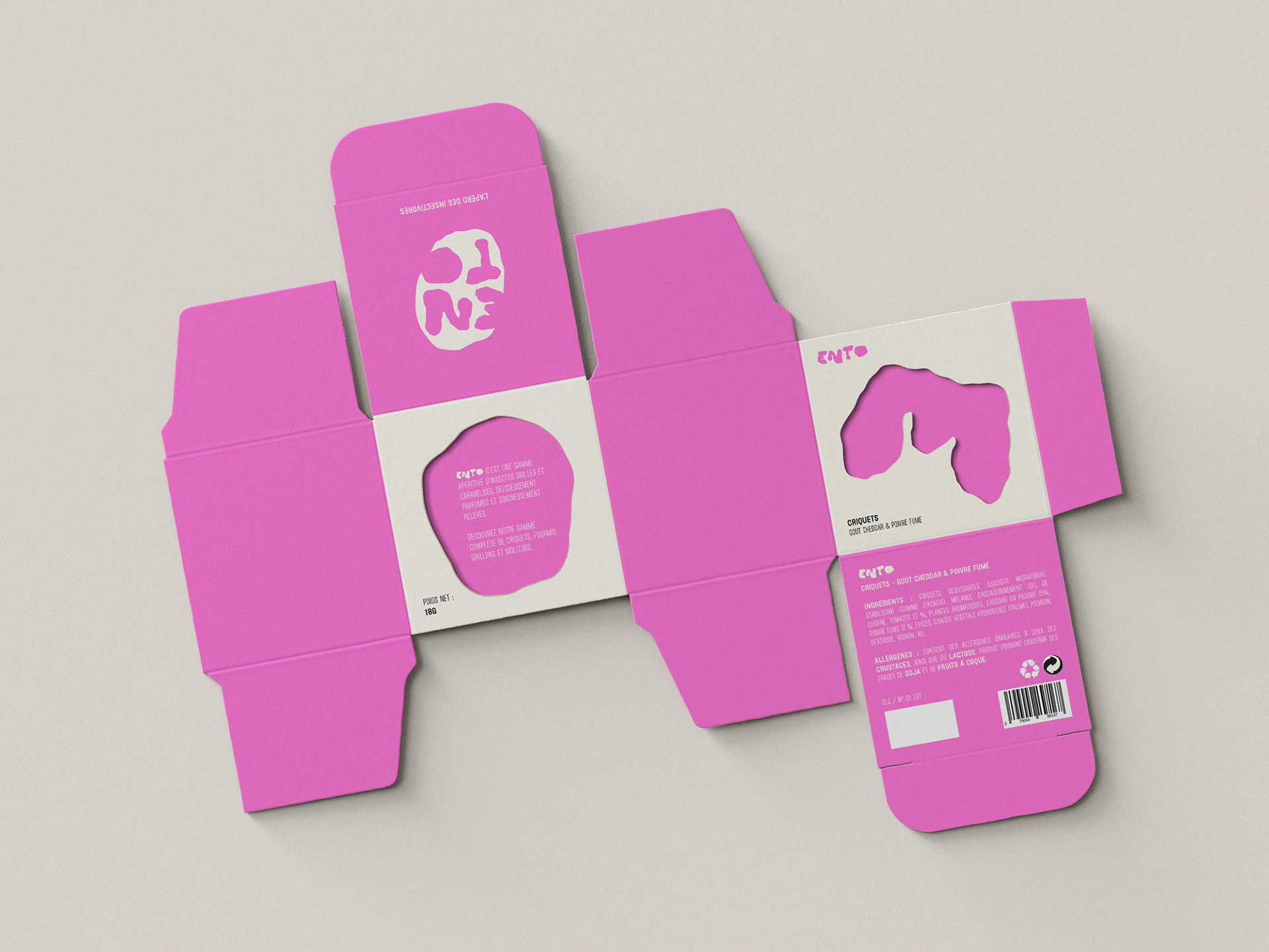
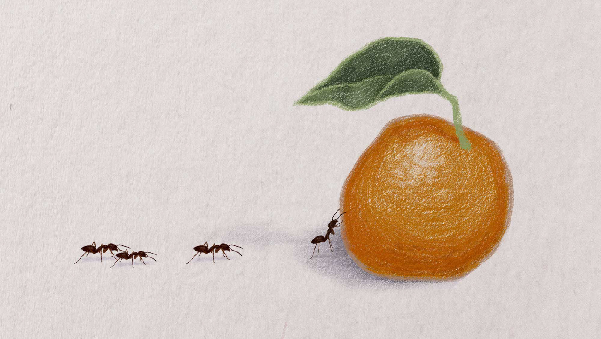
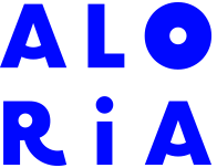
The creative direction draws from the world of insects without ever depicting them directly. Instead, it suggests their presence through their actions — eating, leaving traces. The logo features a nibbled leaf, with perforations forming the letters E, N, T, and O. It evokes consumption, the presence of insects, as well as ideas of nature and fragility. The overall approach balances lightness, humor, and meaning.
The packaging extends this concept with cut-out front and back panels inspired by the logo, creating a direct link between identity and object. A palette of bright, fresh colors breaks away from the often muted tones associated with “sustainable” products, offering a more playful and accessible vision.